
Introduction
Data visualization is a powerful tool that transforms complex data sets into clear, visual narratives, making information more accessible and actionable. In today’s data-driven world, effective visualization is crucial for decision-making across various sectors, including business, healthcare, education, and public policy. This article explores some of the most impactful data visualization examples, highlighting their design, purpose, and the insights they provide.
1. Napoleon’s March Map (1869)
One of the earliest and most iconic examples of data visualization is Charles Joseph Minard’s map depicting Napoleon’s Russian campaign of 1812. This flow map illustrates the size of Napoleon’s army as it advanced and retreated, overlaid with temperature data and geographical features. The visualization effectively conveys the devastating impact of the campaign, with the shrinking width of the line representing the diminishing army size and the color gradient indicating temperature extremes. This map is celebrated for its clarity and the depth of information it encapsulates in a single, concise graphic.
2. John Snow’s Cholera Map (1854)
In 1854, physician John Snow created a map to track the cholera outbreak in London. By plotting cases around a public water pump on Broad Street, Snow identified the source of the outbreak, challenging the prevailing miasma theory of disease transmission. His work laid the foundation for modern epidemiology and demonstrated the power of spatial data visualization in public health.
3. Florence Nightingale’s Coxcomb Diagram (1858)
Florence Nightingale, a pioneering nurse and statistician, used a Coxcomb diagram to present mortality data from the Crimean War. Her circular chart, segmented by cause of death, highlighted that more soldiers died from preventable diseases than from battle wounds. This visualization not only informed military reforms but also showcased the potential of statistical graphics in advocating for public health improvements.
4. The Climate Spiral (2016)
British climate scientist Ed Hawkins introduced the “climate spiral” to visually represent global temperature anomalies over time. The spiral format effectively illustrates the accelerating pace of global warming, making complex climate data more comprehensible to the public. This innovative approach has been widely adopted in climate communication, emphasizing the urgency of addressing climate change.
5. The Gun-Death Visualization (2013)
Periscopic, a data visualization firm, created a poignant graphic illustrating gun deaths in the United States in 2010, focusing on the years of life lost. The visualization uses arcs to represent the potential years victims could have lived, adding an emotional dimension to the statistical data. This approach humanizes the data, fostering a deeper connection and understanding among viewers.
6. NASA’s Eyes on Asteroids (2025)
NASA’s “Eyes on Asteroids” is an interactive data visualization that allows users to explore the asteroid belt and monitor real-time positions of asteroids in our solar system. The 3D model provides an engaging and educational experience, making complex astronomical data accessible to the public. This tool exemplifies how interactive visualizations can enhance scientific literacy and public engagement.
7. The Dear Data Project (2015)
Information designers Giorgia Lupi and Stefanie Posavec embarked on a year-long project called “Dear Data,” exchanging hand-drawn postcards that visualized aspects of their daily lives. Each postcard depicted personal data, such as the number of steps taken or hours spent on various activities, in intricate, analog formats. This project highlighted the beauty of personal data and the creative potential of analog data visualization.
8. Flight Patterns Visualization (2007)
Artist Aaron Koblin created a stunning visualization of flight patterns in the United States using FAA data. The animation depicts the movement of flights across the country, resembling the intricate patterns of an ant colony. This artistic approach to data visualization emphasizes the aesthetic potential of data and its ability to reveal underlying patterns in complex systems.
9. The World’s Population at 8 Billion (2022)
To mark the milestone of the world’s population reaching 8 billion, a visualization was created that uses a circle to represent the Earth, with colors indicating population distribution across continents. This simple yet effective graphic conveys the complexity of global population dynamics in an easily understandable format.
10. The History of Pandemics Timeline (2025)
An infographic presenting a visual timeline of every known pandemic, including information on the number of people affected, geographical spread, and causes. This comprehensive visualization provides historical context to current public health challenges and underscores the importance of understanding past pandemics in shaping future responses.
Conclusion
These diverse examples of data visualization demonstrate the power of graphical representations in conveying complex information clearly and effectively. From historical maps to interactive tools, each visualization serves a unique purpose, whether it’s to inform, persuade, or inspire action. As data continues to play a pivotal role in decision-making, the ability to interpret and create compelling visualizations will remain an essential skill across various fields.
FAQs
1. What is data visualization?
Data visualization is the graphical representation of information and data using visual elements like charts, graphs, and maps. It helps to identify trends, outliers, and patterns in data, making complex information more accessible and understandable.
2. Why is data visualization important?
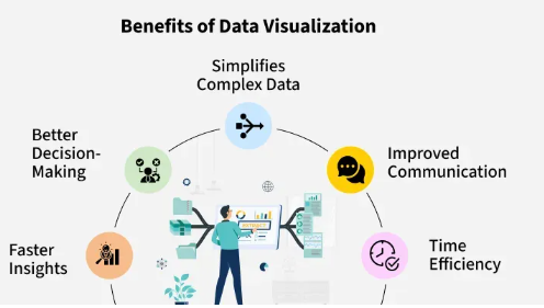
Data visualization is important because it allows individuals and organizations to quickly grasp complex data, identify patterns and trends, and make informed decisions. It enhances comprehension and retention of information, facilitating better communication and problem-solving.
3. What are some common types of data visualizations?
Common types of data visualizations include bar charts, line graphs, pie charts, scatter plots, histograms, heat maps, and choropleth maps. Each type serves a specific purpose and is suited to different kinds of data and analysis.
4. How can I create my own data visualizations?
You can create your own data visualizations using various tools and software, such as Microsoft Excel, Google Sheets, Tableau, Power BI, and online platforms like Canva and Visme. These tools offer templates and features to help you design effective visualizations tailored to your data.
5. What are some best practices for data visualization?
Best practices for data visualization include choosing the appropriate chart type for your data, keeping the design simple and uncluttered, using colors effectively to highlight key information, labeling axes and data points clearly, and ensuring accessibility for all users.